
The Rebrand
Fineappl is a mental health brand helping young people manage everyday challenges through therapy and self care tools.
The brand needed to feel warm and approachable for a Gen Z audience, not clinical or overly serious. Mental health is a serious subject, but the brand didn't have to sound like one. The rebrand leaned into illustration, bold, expressive visuals that felt as human as the people it was made for, without losing the weight of what it stands for.

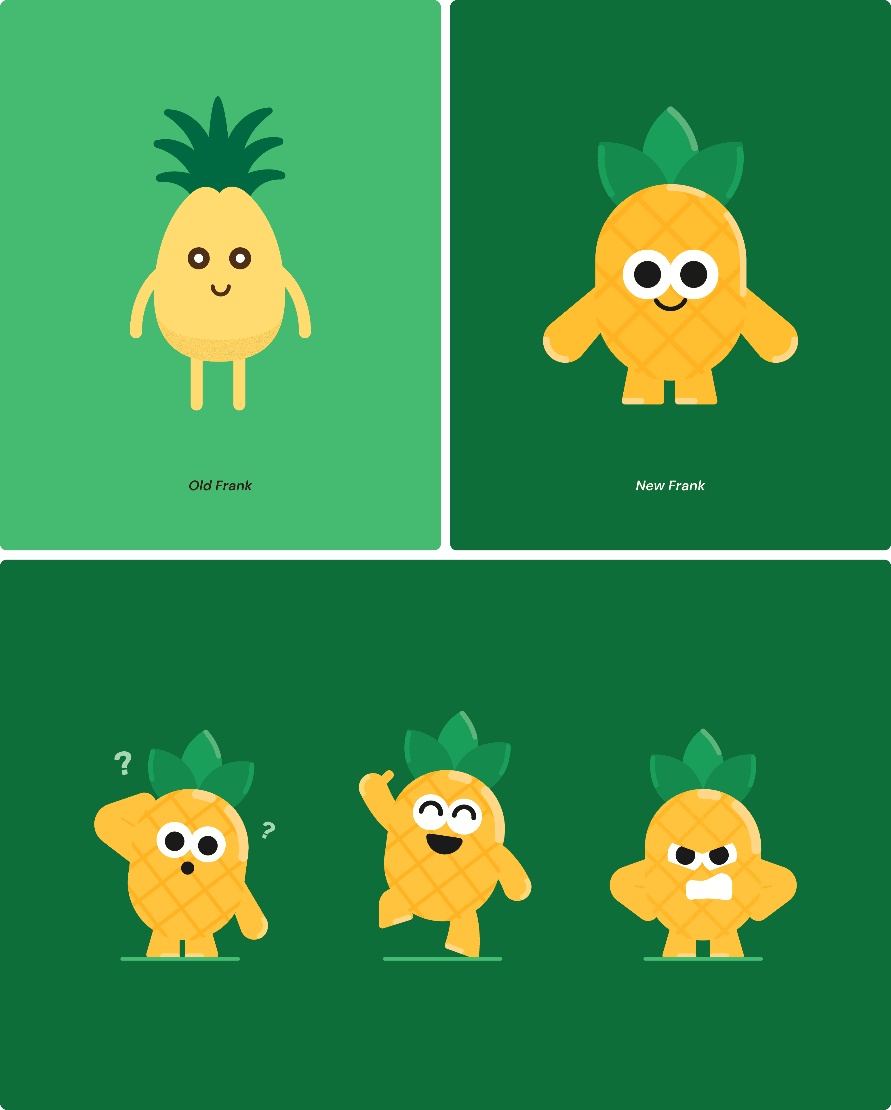
Redesigning Frank
Frank the pineapple is the most personal part of the brand, it's where the name comes from. The character existed before the rebrand, so the idea was to carry him forward, not replace him.
What changed was how Frank moved and spoke. The redesign made him more expressive, giving him room to carry more of the brand's personality. A pineapple, a familiar symbol of welcome and warmth, felt right for a brand built around offering a supportive, judgment free space.
The Core Characters
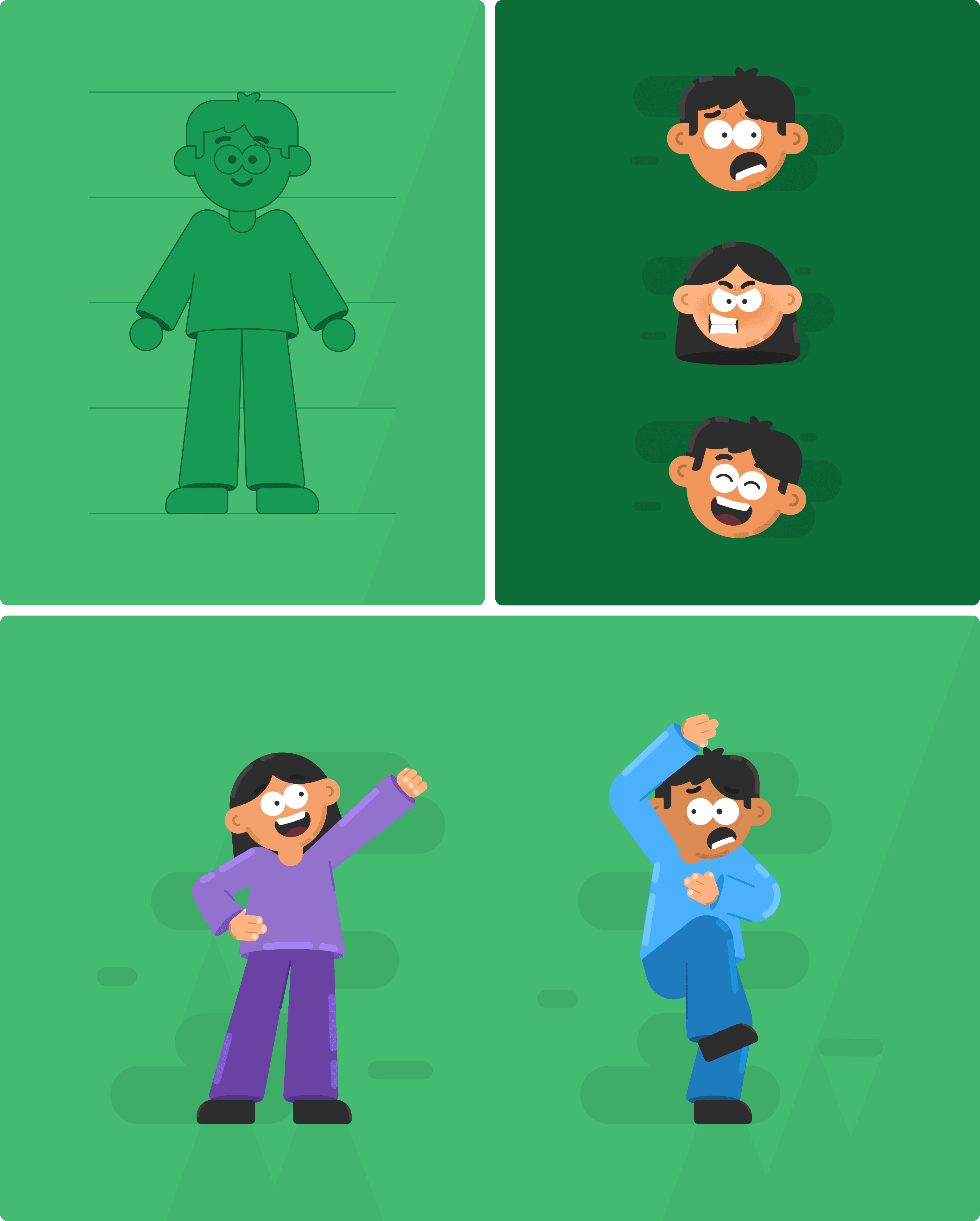
Two characters carry the whole visual story. Their expressions and small interactions do the heavy lifting, showing different emotional states in a way anyone can relate to.
Keeping their personalities simple was intentional, the more universal they felt, the more people could see themselves in them. Rounded shapes and soft forms tie everything together, giving the characters a warmth that feels friendly.
Illustrations for the App
The in app illustrations follow the same rounded, friendly language as the mascot and characters, keeping the product feeling consistent with the rest of the brand.
Each one is built around a single clear idea, with supporting details added only where they help someone understand the message faster, never just for decoration.

Beyond the Screen
The same visual language carried through to standees, booklets, and brochures made for events and everyday brand communication. That consistency kept Fineappl feeling like itself everywhere people encountered it.

Selected Work
" transform="translate(3 9.539)" width="21px"/></svg>)

Say Hi
" height="13.787130074081423px" id="urHaguEaO" transform="translate(2.031 6.105)" width="21.937549591064453px"/></svg>)
" height="15.031220178985595px" id="yUajfqqCT" transform="translate(5.484 5.484)" width="15.031219940185546px"/></svg>)
" height="14.624999880981445px" id="CowC2k8pi" transform="translate(3.25 5.688)" width="19.5px"/></svg>)
" height="19.5px" id="pGa0pwEMM" transform="translate(5.688 3.25)" width="14.625px"/></svg>)
Small Moments, On Social
The content stayed close to everyday moments, small, relatable struggles the audience actually deals with. Carousels used simple spot illustrations to move quickly through an idea while single posts leaned on a more detailed, storytelling style of illustration, giving the message room to slow down and say more.