
The Brand Brief
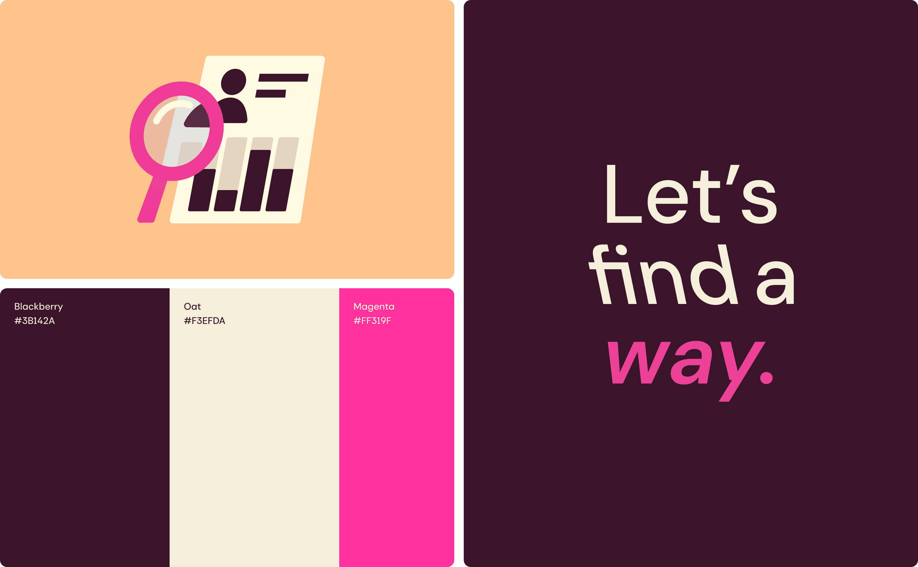
Wayground is an edtech platform that brings instruction, practice, and assessment together in one AI supported space, helping students learn faster.
This project shaped the visual language around that idea, a mascot, an illustration system, and icons built on the same shape and color logic. The aim was consistency without rigidity: wherever Wayground shows up, a slide, a poster, a t shirt, it should read as the same brand.
Building the Piñata
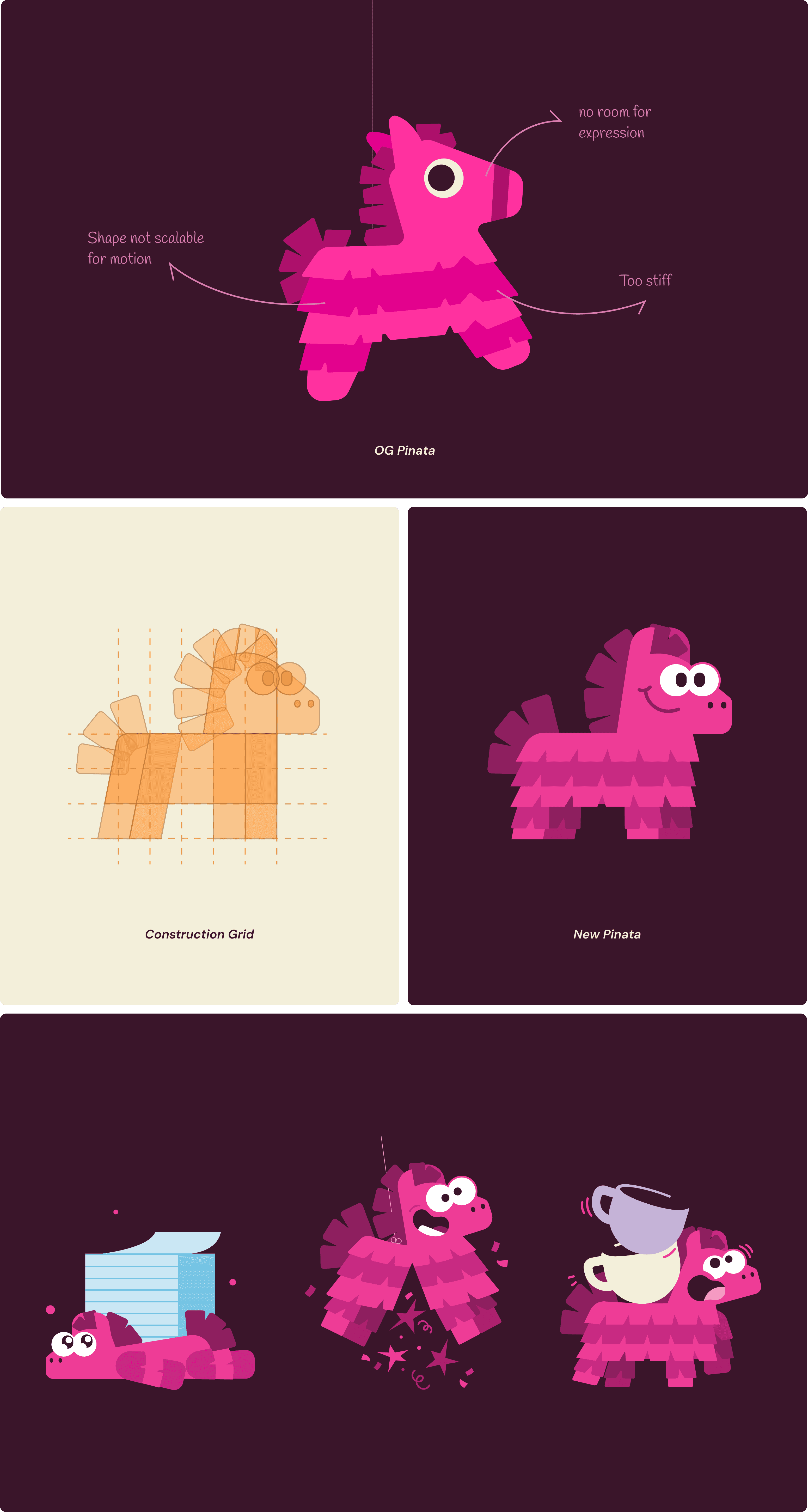
The piñata's personality was clear from the start: a classroom troublemaker who's secretly the teacher's pet. Chaotic, but never disruptive. The earlier version felt stiff next to that, more of a static shape than a character with any energy.
The redesign is built from one square, repeated into a grid, then shaped by adding or removing blocks along it. That grid keeps every pose consistent and lets the character move naturally between static art and animation, all while staying true to its playful, a little dramatic personality.
The Illustration logic
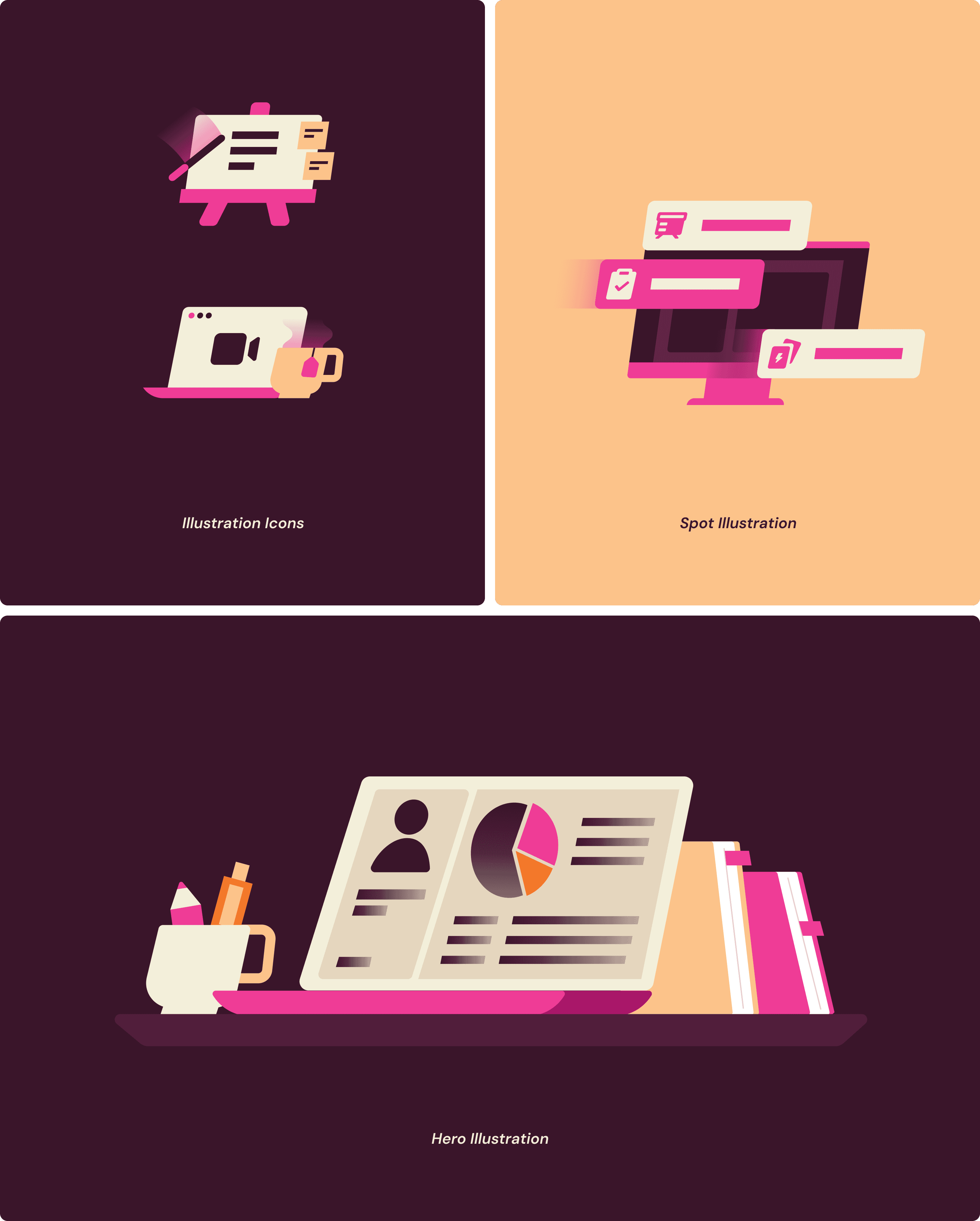
The system runs on one shape language: an angular form drawn from the Wayground logo. It carries through the icons and spot illustrations, so even a small icon reads as Wayground at a glance.
The palette stays close to the brand's core colors, since most of this system lives in decks, PDFs, and marketing collateral, where staying recognizable matters more than standing out.
Where it shows up
Beyond the screen, the system carried into posters, merch, and brochures, each one keeping the same colors and character so Wayground felt familiar wherever people ran into it.

Selected Work
" transform="translate(3 9.539)" width="21px"/></svg>)

Say Hi
" height="13.787130074081423px" id="urHaguEaO" transform="translate(2.031 6.105)" width="21.937549591064453px"/></svg>)
" height="15.031220178985595px" id="yUajfqqCT" transform="translate(5.484 5.484)" width="15.031219940185546px"/></svg>)
" height="14.624999880981445px" id="CowC2k8pi" transform="translate(3.25 5.688)" width="19.5px"/></svg>)
" height="19.5px" id="pGa0pwEMM" transform="translate(5.688 3.25)" width="14.625px"/></svg>)